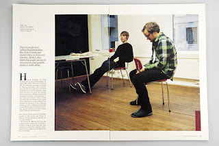
I went looking on behance for a range of examples that visually inspired my in terms of layout. Initially I came across some slightly alternative layouts but as I went looking through I feel I actually preferred the layouts that were cleaner and easier to read.
PROJECT 1
I really like how the initial double place is spread out, it is still readable but yet visually interesting and very different from what the normal contents page would look like. It gives a good sense of the type of magazine it is. The typeface is also simple, the titles are in helvetica. The second image carries on this format, with not having too much type on the page. This is something that I want to have in my publication, less is more, and not to try and fit too much information on each page. I would rather have more pages and make the publication more inviting to read.
On the third page there is slightly more text however it is all kept at the bottom of each page so it doesn't become too over powering. I do feel that there could be more white space left between each of the columns which may make it look neater, however it still works.
PROJECT 2
This project caught my eye because of the huge amounts of white space used on each page. The front cover uses the stock as part of the appearance, it is very simply designed but very interesting to look at. This is something I will be exploring for my cover, just having type or the logo on the front and maybe a short line about the magazine so that people who see it will know what it is about.
I think that this contents page is too simple, it is verging on the boarder of being boring, however it is a good example of making the most of white space and an interesting layout.
There is a lot more text on this page, and no colour. I will be using colour in my publication but I don't know what colours yet. I am including and interview for each earnests so this is a good example of how to lay it out without it being too overpowering.
A typographic publication which uses monochrome. I don't particularly like this layout but it is something to refer back to incase I just want to have one quote on a page and have a full spread of a photograph on the other page.
PROJECT 3
I chose this project initially as a reference for a landscape orientated publication, but after looking through the project I also wanted to use it as a good example of photography and type across a double page spread. The photograph on the image below is unusually cut off at an angle, making the page design more interesting.
The use of typeface and colour is clean, simple but elegant, something I want to be able to do in the magazine.
PROJECT 4
This is a slightly busier style of design for a publication, instead of focusing on the use of white space it has a combination of large scale images combined with type and translucent shapes; an interesting combination but also a good example of having photography flooding the background of a double page spread with only a small amount of type on the page.


No comments:
Post a Comment