
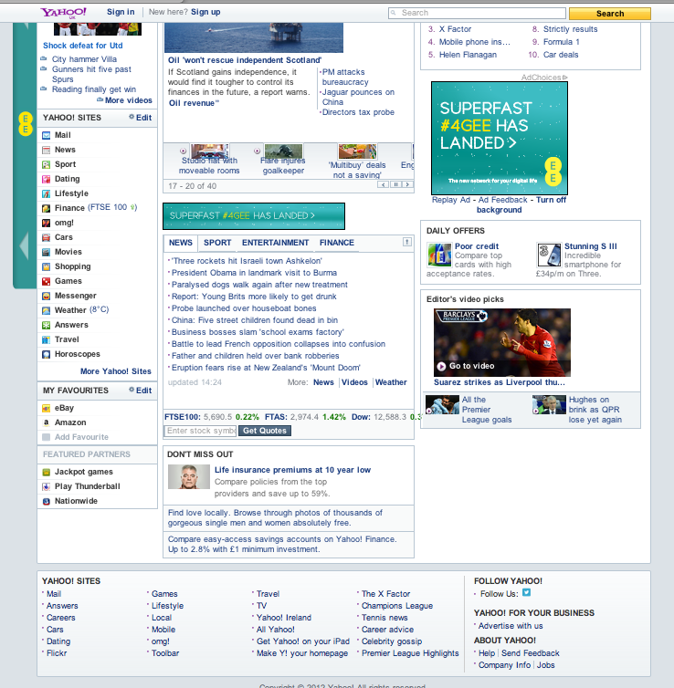
These are screenshots of the currents design, layout, functions and features of Yahoo. I will also do the same for its competitors and then work out which elements of the site are overcrowding it and which elements are necessary to keep the interest of the target audience.
Overall I think the main reason why Yahoo isn't as popular as Google and Facebook is becuase it is far too cluttered, there is no general style to the website and it is too complicated to navigate around. It doesn't look very smart, clean (like Google) and it doesn't have a USP. When using the interenet, no matter what age you are, you want it to be simple and quick. The average time it takes people to have an opinion on a website is 2-3 seconds, if something doesn't load that fast or they cant find a way to navigate around it, they will give up and look for another better designed and easier to use website. In this case, less is more.

This what Yahoo currently feels is the best icons / popular pages to advertise.


The icons don't have much of a general style, I feel they all need to be the same colour and be better design


No comments:
Post a Comment