Here are a few samples of graphic patterns that I have found google and on shutterstock, a basis for me to to develop graphic patterns for each of the front covers of the publications.
Graphic Patterns

Showing posts with label Cover Art. Show all posts
Showing posts with label Cover Art. Show all posts
Tuesday, 13 November 2012

Cover Art - From Buamai Website
I have found a range of designs that have really helped inspire me for the cover art, and have taken the ideas for the design of these publications in a new direction. All of the below images I found on the the previously mentioned website. I also hope to develop my photoshop skills in this part of the brief and create an image, edit a series of images or create a graphic pattern than I can apply to the brand and give it more of a style.
I want to ensure that I have a similar theme accross all 3 covers so they are easily recognised as Alternative Music Room Publications.




I want to ensure that I have a similar theme accross all 3 covers so they are easily recognised as Alternative Music Room Publications.


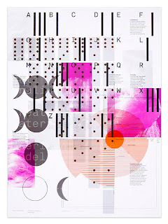
This reminded me of the style of fine art that I used to produce at my AS and A Level, very colourful, modern and abstract. It would definately make an interesting cover for one of the publications.

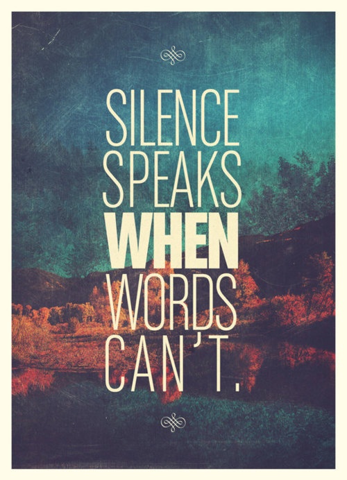
This made me think about having a quote about house music on the front of it, or a quote from on of the selected producers the publication focuses on.


Simple typography.

Using a simple graphic patterns as a compound mask over a disguised image.

Using a coloured stock - this would be better for screen printing rather then digital printing.

Having a quote that takes up the majority of the cover, this I could also experiment with using a different colour / type stock.

There were a range of 3 designs like this, all of which used bright colours. I could try and find a tutorial online for photoshop and see if I can create something with the theme of distorted bright colours, similar to the lighting at house music events.

A simple graphic pattern. I could use this over the range of 3 pubcliations.

Simple graphic design / pattern placed on a gradient background. A clean design but visually intersting, I am not sure how I can visually represent house music in this manner though.


Graphic artwork in the background of the cover with the logo centralised and the main focus of the cover.

Stationary range, I need to start developing the range so the logo applies across it all.

Simple black logo with colourful graphic shapes / patterns applied across a range of designs each using a different colour scheme.


A typographic design


These two images above are the type of designs I want to find out and learn to make on photoshop.


Simple, colourful pattern turned into shapes. I want to keep the front of the covers simple but colourful, to make them look smart but still stand out.


This was the first image I found off google which led me to the website, I could have a simple black edit of the logo in the centre of the cover and have the rest of the page filled with colourful patterns all of which are in the colourscheme. I need to do a bit of reserach into graphic patterns.

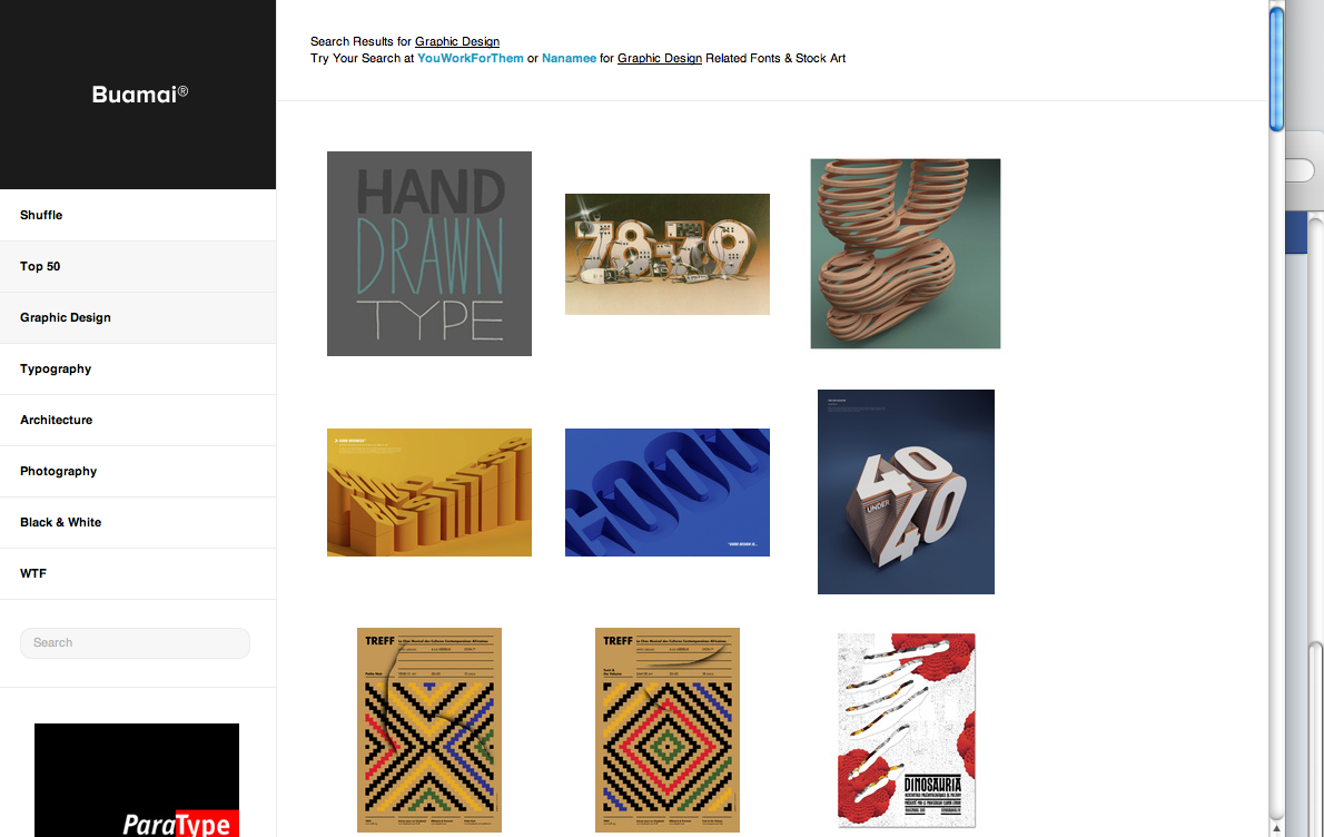
Buami Website
This is a website that I came across when looking for visual inspiration for the publication covers.
http://www.buamai.com


http://www.buamai.com

Subscribe to:
Posts (Atom)